The other day I mentioned how depressing and uninspiring our current weather is. It's all a gray mass of gray and has been so for weeks. This is actually one of the reasons we survive the short days here in the Scandinavian hemisphere: nightfall at 3:30 in the afternoon is a relief compared to the gray mush we spend the day in.
Anyway, needing some exercise today and with no intention of turning it into a photo excursion, I saddled my bike and rode into the grayness, armed only with my cell phone. But of course, I had not gone for more than 10 minutes before I caught sight of the most beautiful and depressing abandoned... well, actually, I don't know what it used to be, but anything abandoned is worth a picture, so off the bike I hopped and used my cell phone to capture the below likeness.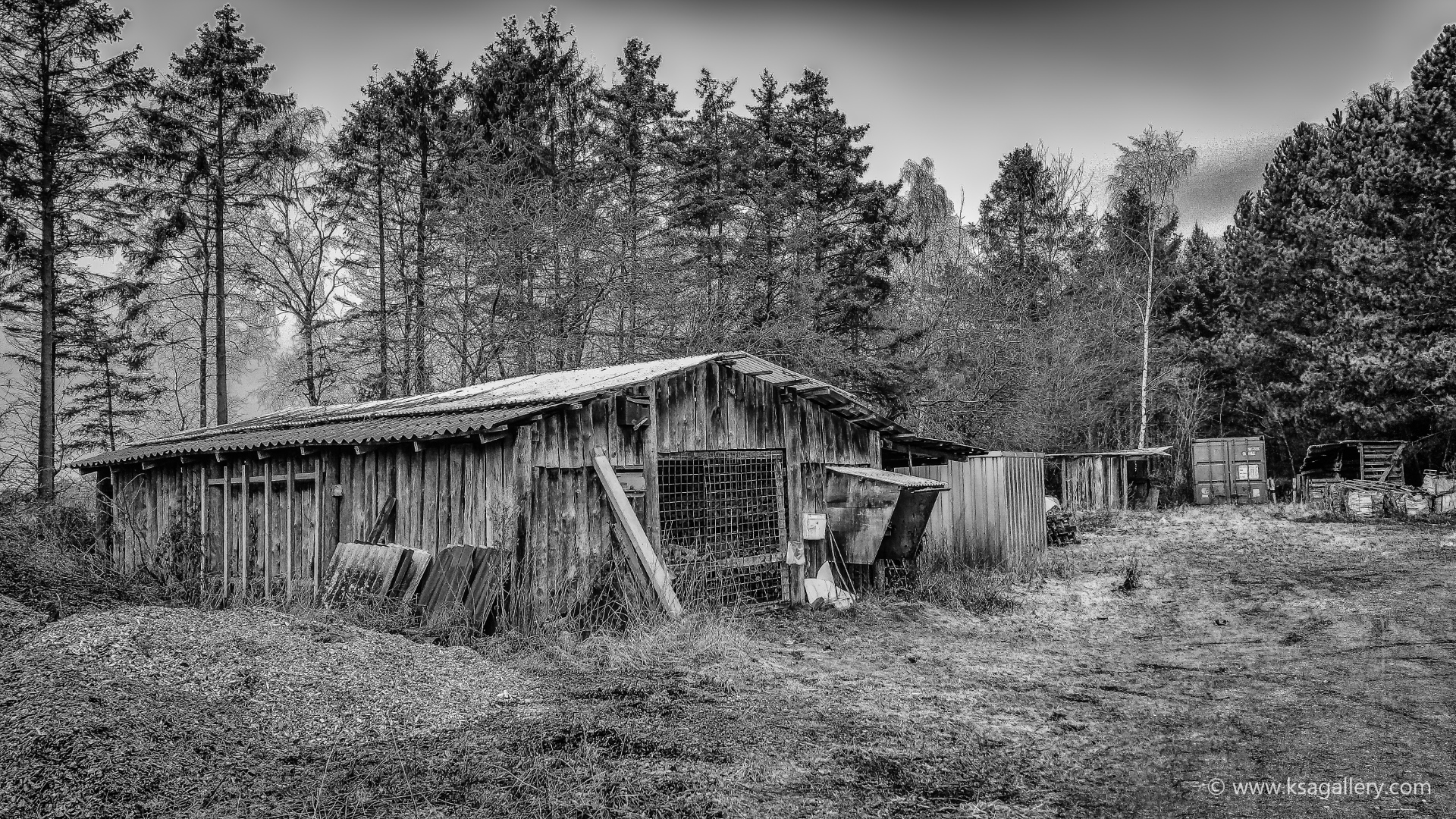
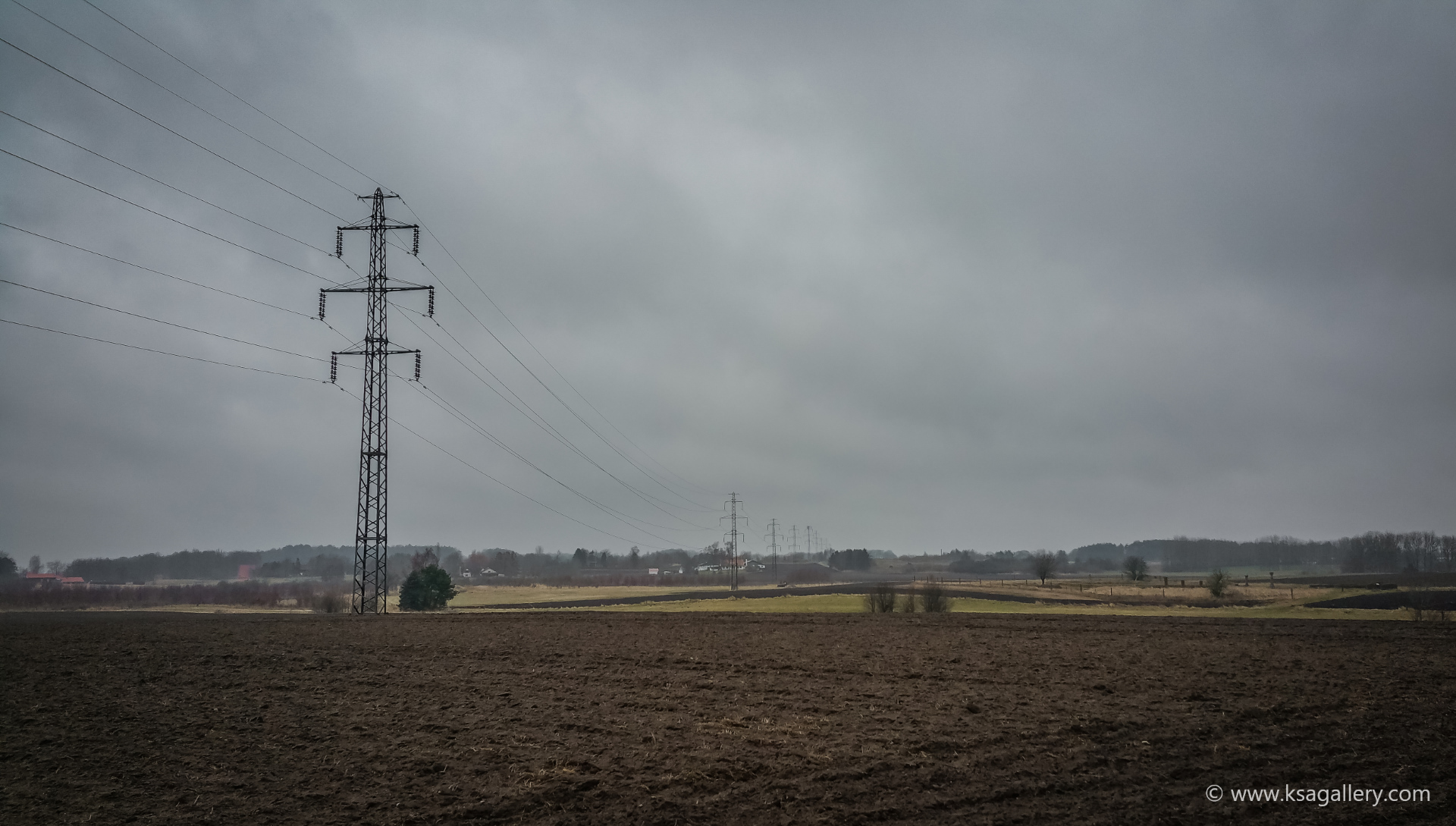
Sensing that all the grayness might be negotiable after all, it wasn't long until I came upon my next suitable motif. A flat, depressing, gray, dreary, and did I mention, gray, field of grayish brown soil, broken only by a string of bare, cold, industrial power poles. This is as gray and boring as it gets, so I figured I'd capture it if only to show you what you're up against in this country. However, while this is by no means a masterpiece, I felt that the spot actually had some potential, so I plan to return in the spring and see if I can capture a nice sunset here.
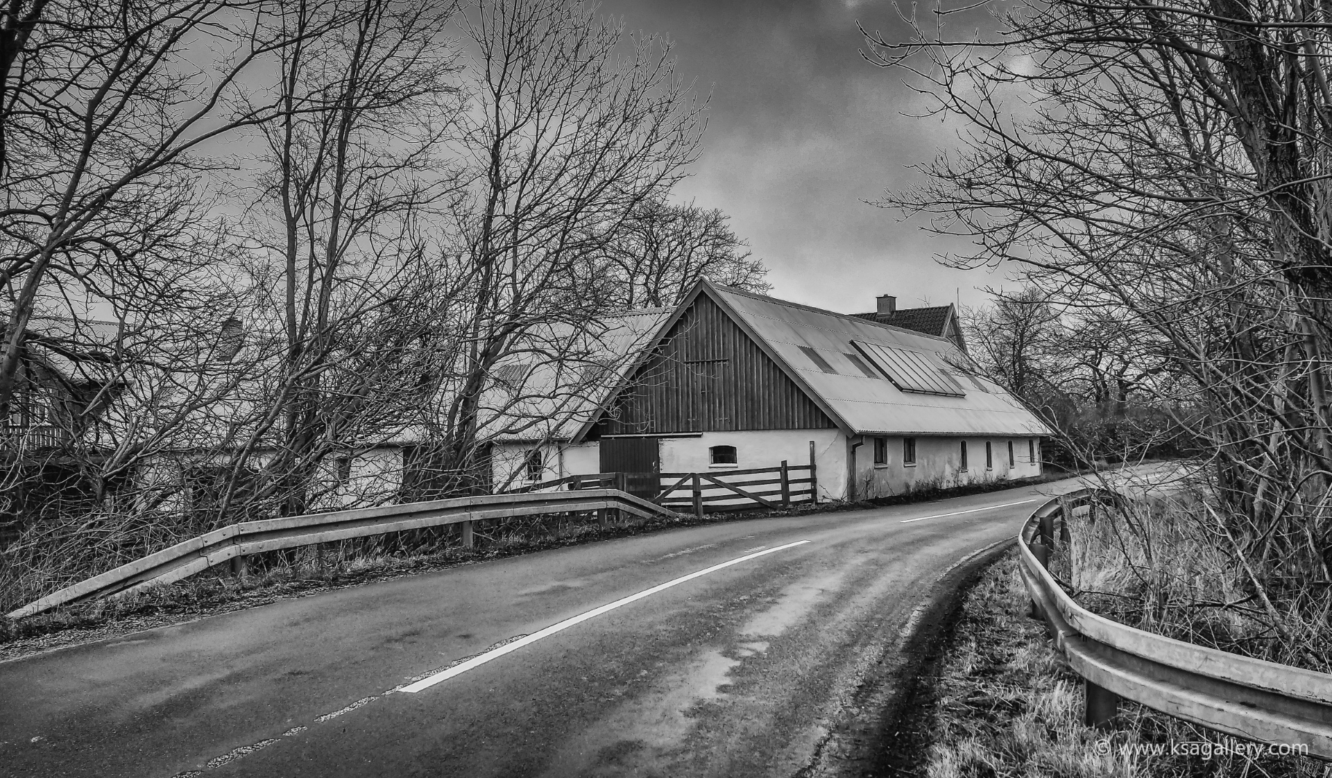
For the next image I once again had to rely on black and white to make it interesting. This may be my favorite shot of the day, but only after I took it through my Silver Effects Pro plugin.
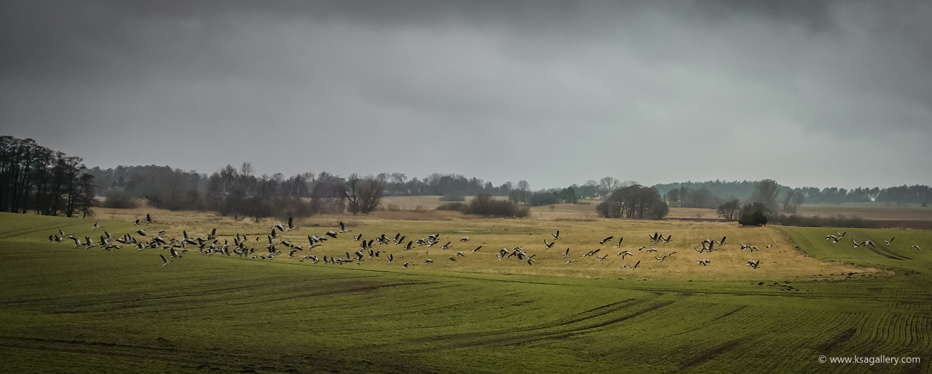
The colors return for the next one, as the flock of geese taking off from a field makes up for an otherwise depressing scene of gray Danish flatness. I was lucky too, as a lone car passing by stirred up the birds enough for me to capture this pretty scene. A few pictures taken moments before this one, just showed the birds standing around doing nothing.
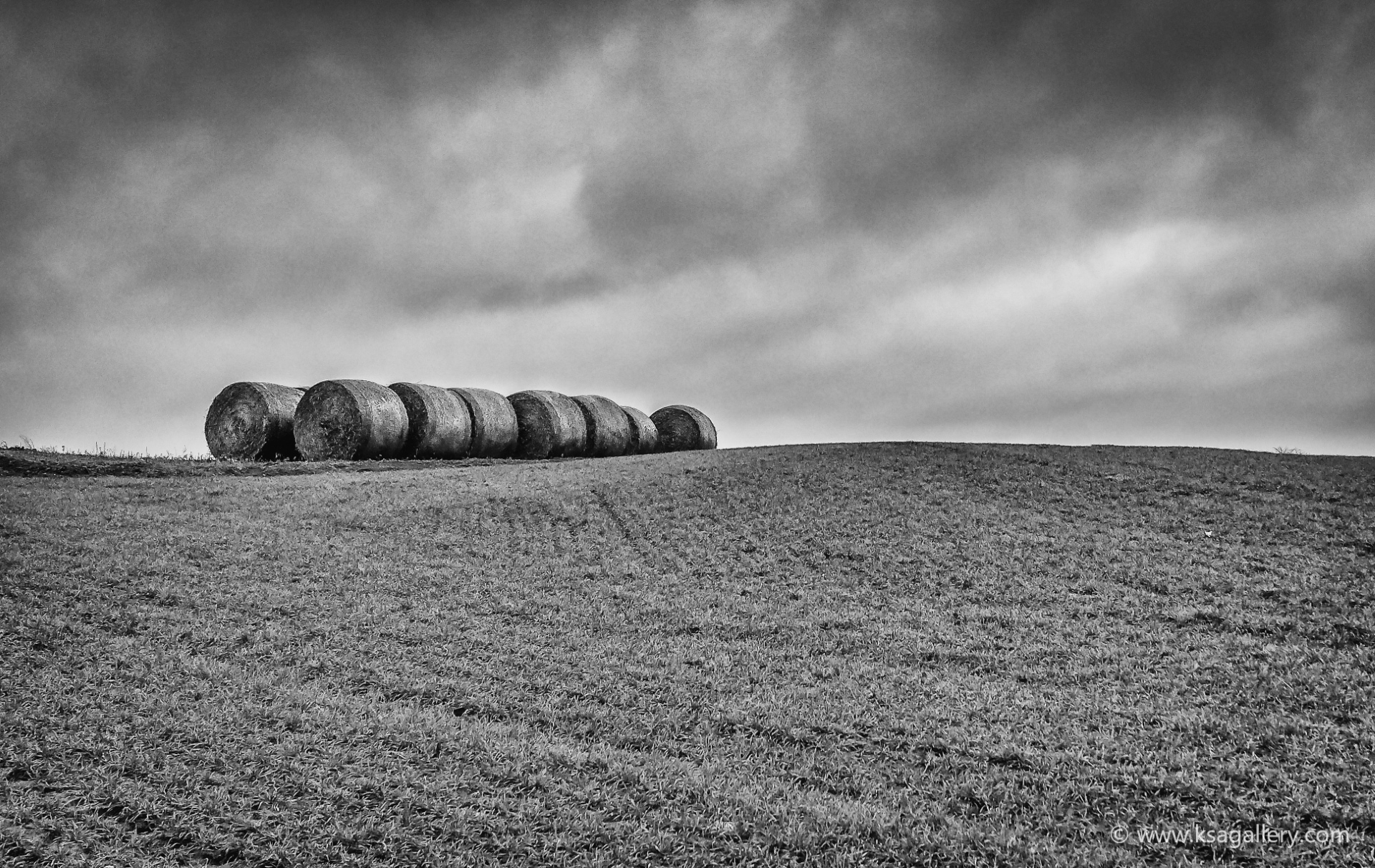
Finally, an attempt at mimicking Flickr star Nick Brundle whose favorite subject seems to be rolled up hay bales. I'm not quite at his level yet, but I was rather pleased with this one and its simplicity.
Well, while January and February will never be my favorite shooting months, I guess I got a little bit of confidence in myself today that you can in fact get something worthwhile out of the gray, light-deprived mush that we call winter around here. If nothing else, I got some much-needed exercise, covering more than 15 kilometers on my trusty iron horse.
... but that doesn't mean a photo can't be. I mean, I have personally been skeptical of black and white photography. If color photography had been invented first, would anyone have ever thought about black and white? I doubt it.
But lately I have come to appreciate the art of black and white photography and have turned more and more of my own pictures into black and white shots. What happened was that I realized black and white wasn't just black and white. Black and white can have as many different expressions as color photography. I discovered this when I installed Google's Nik Collection after Google started to offer this otherwise expensive software for free. Apart from well-known post-processing tools such as noise-reduction and sharpening, Nik Collection includes a tool called Silver Effect Pro that is basically an advanced black and white converter. And you don't even have to use the advanced options. The presets are usually enough to blow my mind and do the job for me.
So below are some of my own favorite black and white shots, all made using Silver Effect Pro, and with a feeble attempt to explain what, in my opinion, makes them work in black and white.
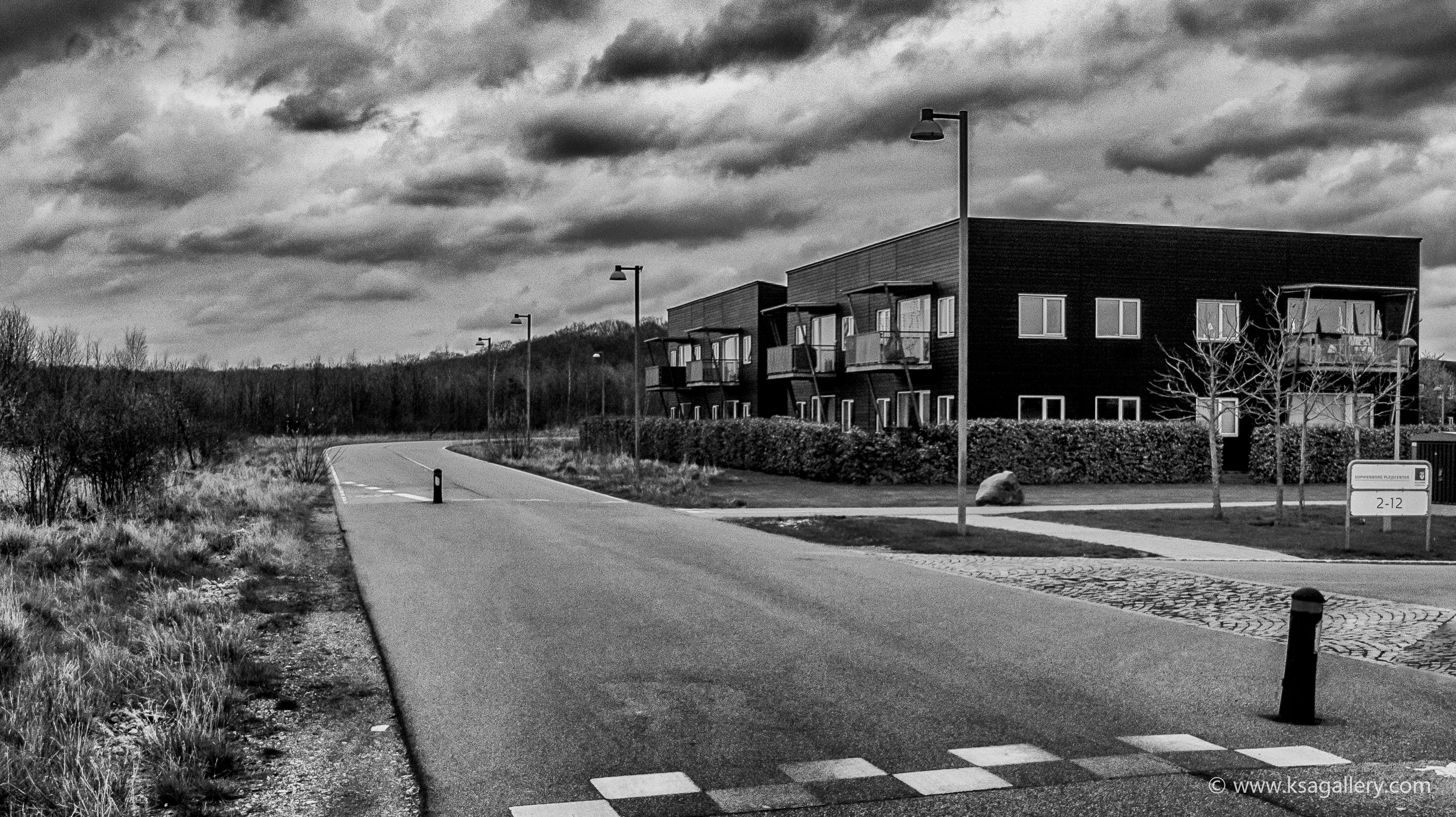
I think this was the picture that opened my eyes to the power of black and white. In color, a rather bleh image of a neighborhood development, in black and white... something, to me, much more powerful.
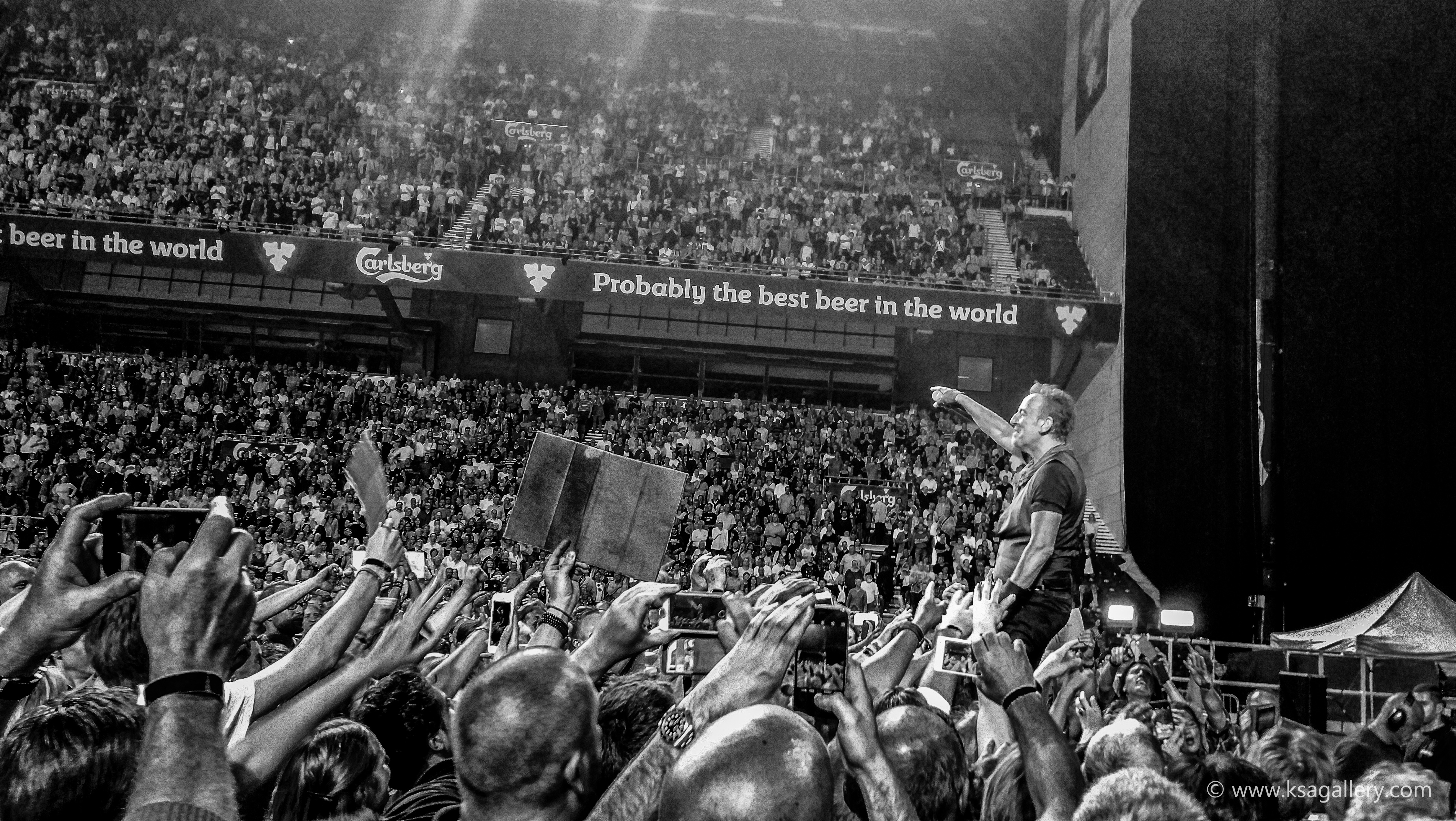
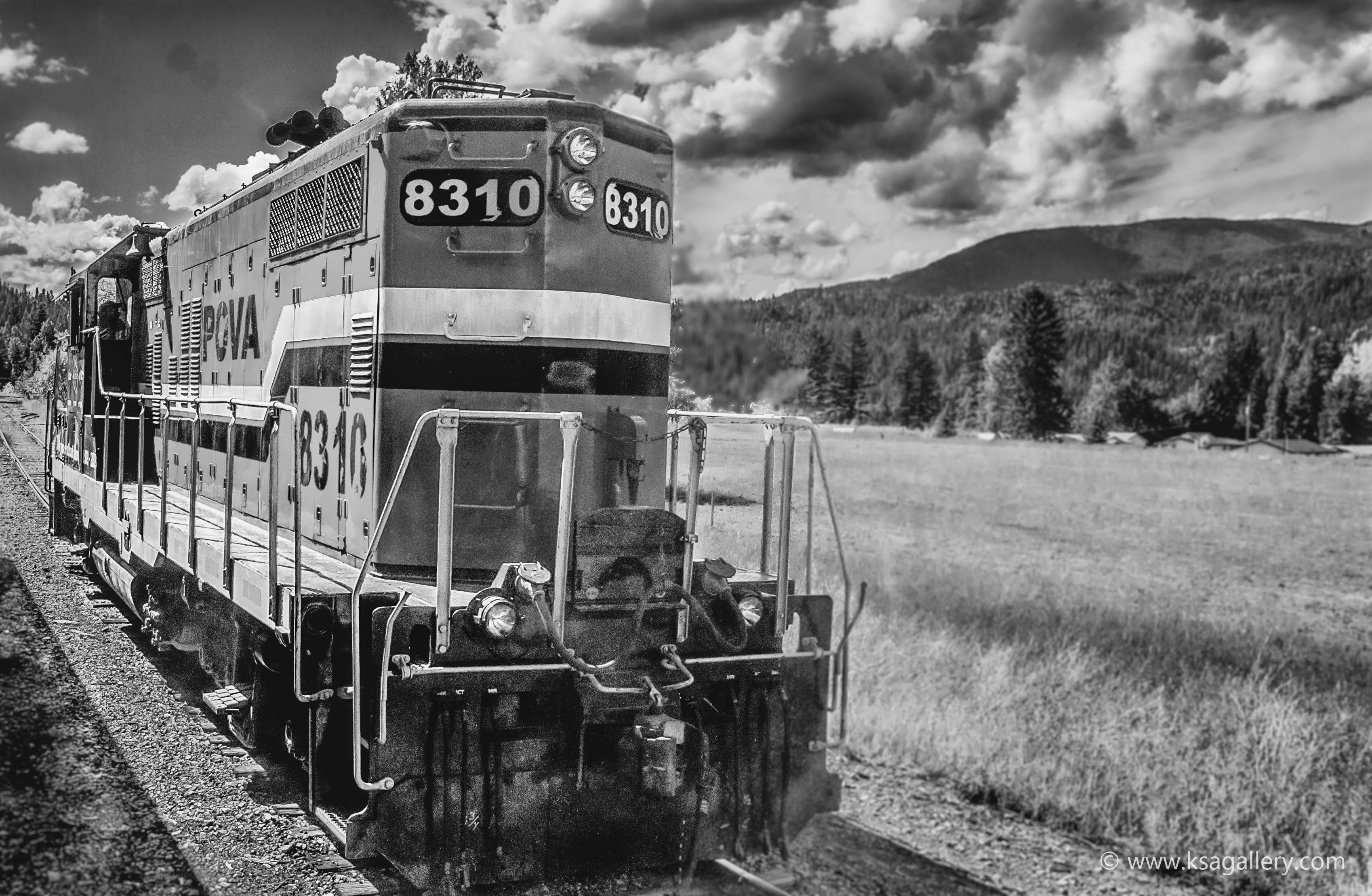
A picture I took at a Bruce Springsteen concert in Copenhagen in 2016. In this case, I think the black and white style makes an otherwise very detailed image more soothing for the brain.

This abandoned cabin in Montana was a slam-dunk, I thought. But I just couldn't get it right in post-processing due to the colors just being completely uninteresting. So what do you do? Remove the colors, of course. That hit the nail on the head.
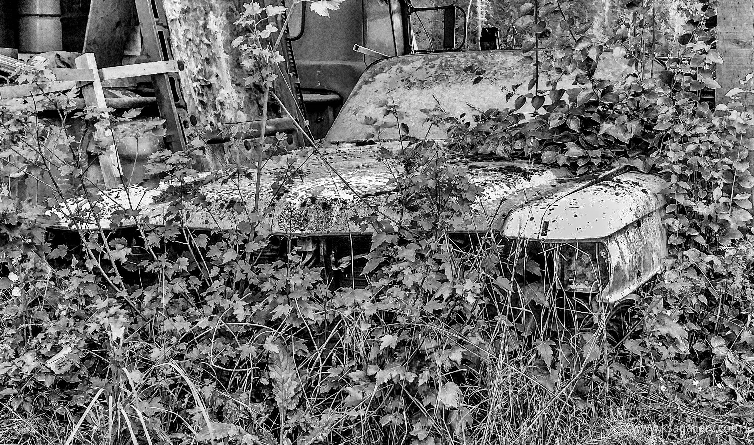
The black and white here helped erase the difference between the car and nature and thus emphasizing nature reclaiming its materials. I could never have done that in color.
Another example of a picture that just didn't work very well in color, because the colors were just kind of blah. Still not for everyone I guess, but I like it.
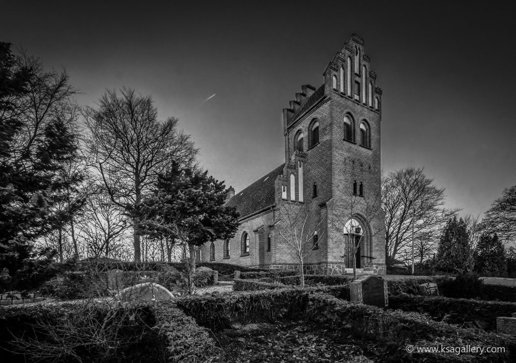
I posted a color version of this in my "Best of November" post, but I actually think it works even better in black and white. Technically and artistically one I'm rather proud of.